Open source spatial maps are plentiful, however finding something that evokes the curious mind can be challenging. I was curious to understand if the natural resource distribution of countries correlated with their gross domestic product (GDP) per capita, meaning if particular countries that had an abundance of mineral resources, will they also have a higher GDP than other countries of the world. Our hypothesis suggests that wealthier countries have a predisposed abundance of mineral resources, that could in a future experiment or analysis can explain how they got so wealthy in the first place.
I got the first dataset, i.e. the distribution of mineral resources from USGS. The dataset from 2011 provides the distribution of mineral resources from all countries of the world with their specific geospatial coordinates. It also provides further data on the ores and rocks, however the simplicity of our mapping exercise, we have focused on natural mineral resources such as copper, aluminium, lead, zinc, etcetra only.
The second dataset was obtained from the World Bank Open Data Catalogue and provides a breakdown of each country’s GDP, GDP per capita and annual GDP per capita growth. For the sake of our comparison, I have used GDP per capita. The idea is to place two world maps in juxtaposition and understand whether there is a relationship between the distribution of GDP and mineral resources across countries.
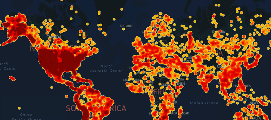
The best way to present the first dataset was using intensity maps. An intensity map is able to put the concentration of mineral resources on a spectrum with higher saturation representing regions that have a higher mineral concentration. The United States and the western strip of South America have the highest concentration of natural minerals. Central Asia comparatively has a power concentration of mineral resources.
However, this distribution of mineral resources get particularly interesting when the second dataset is plotted on a choropleth map. Countries with a higher GDP per capita in 2011 have a darker color intensity (red) than those with a lower GDP per capita (yellow). In the map, the United States is seen to have a darker color intensity, however similar GDP per capita is also seen for Western Europe, Australia and Japan. Central Africa and some parts of Central Asia have the lowest GDP per capita. Using this particular style made most sense to separately identify the countries with higher or lower GDP per capita.
Given our initial hypothesis, except in the case of United States, the abundance of mineral resources do not correlate to the GDP per capita of the country.
I chose the map styles that would be most effective in identifying the countries with more mineral resources or higher GDP per capita while keeping allowing us to hover and understand the granularity of the distribution.
